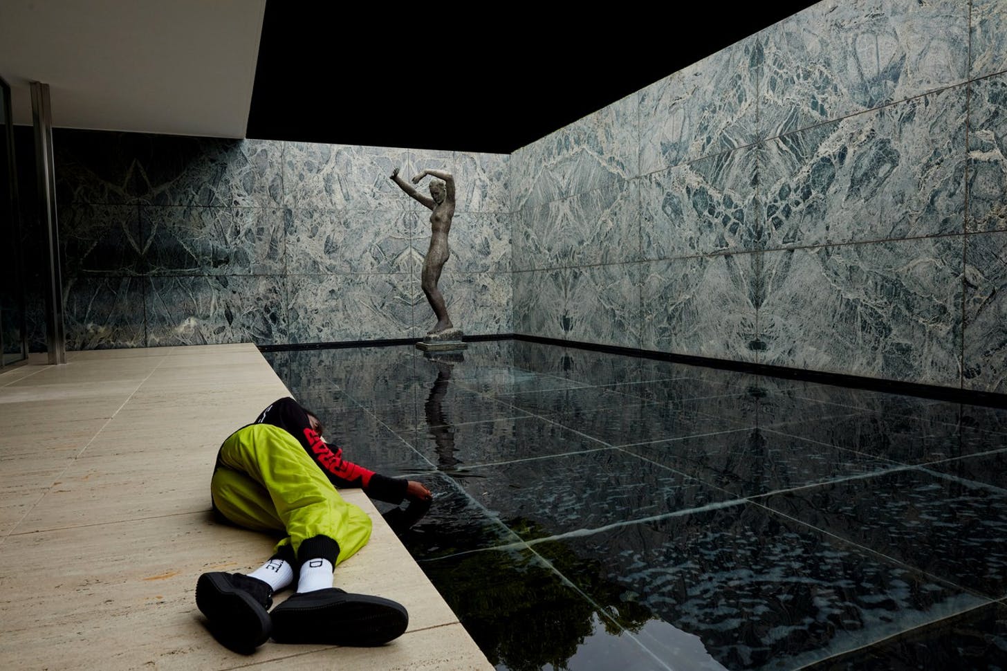
The Manifold Transparencies of Virgil Abloh (Archinect)
Written for Archinect
Upon receiving a copy of his monograph, Figures of Speech, published by Prestel in conjunction with an eponymous exhibition of his career at the Chicago Museum of Contemporary Art, I began to question how his brief time as an architecture student influenced the choices he has made as a fashion icon, as well as what the architecture community can learn from a figure as multivalent and as inimitable as Virgil Abloh.
A few superficial connections can initially be drawn between Abloh’s work and his years at IIT: his signature use of the color orange, for instance, brings to mind the orange glass used throughout IIT’s McCormick Tribune Campus Center, completed by OMA while Abloh was a student at the school; he has cited Mies van der Rohe as a continuing inspiration for his practice, once stating that his time “studying architecture in Crown Hall had a lasting effect on [his] aesthetic;” and the adage that architecture school provides a “renaissance education” certainly holds true for the polymath, a leader not only in fashion design, but also graphic design, furniture, set design and music.
However, after reviewing Abloh’s 21-year body of work, I discovered that his unique style and rise to fame can be attributed to a close read of the word “transparency” through its varying and overlapping definitions.
Transparent Materiality
After “countless mockups” of the album art for Kanye West’s Yeezus in 2013, Abloh settled on a small square of orange gaff tape, “to come to a final purity that was, in essence, like an open casket for a CD.” The transparent CD case functions much like the glass architecture popularized by Mies van der Rohe and other modernist architects, in the sense that it designs its own ‘exposure’ only to carefully design that which is exposed.
As architecture theorist Beatriz Colomina recently argued, “modern architecture exposes itself, but not by revealing everything. Rather, it stages the act of exposure, calling the eye in.” Abloh’s use of material transparency, in other words, is a symbol for ‘honesty,’ in that neither the interior construction nor the items it contains would be described as ‘hidden.’ Though Abloh often achieves transparency in his work through the use of plastic or plexiglass, he has also employed sparse metal meshes in his furniture designs to expose their construction from all angles.
Transparent Sourcing
“Man can never expect to start from scratch,” Marcel Duchamp once insisted. “He must start from ready-made things, like even his own mother and father.” While it can be argued that all creative projects rest on the shoulders of their predecessors, only a handful come by it honestly and even fewer with intent. Abloh, however, likes to joke that Duchamp is his lawyer when reflecting on his design methodology: “[Duchamp is] the legal premise to validate what I’m doing [...] streetwear started from the gesture of taking a logo, flipping it upside down, and sewing it back on again.”
For Twentythirtyfive, Abloh’s speculative furniture exhibition sponsored by the Swiss furniture company Vitra, he scoured their archive to design playful reproductions of their most iconic products, with examples including a seesaw with Eames wire chairs on either side, a collection of flat-orange facsimiles of industrial cinder blocks and a plexiglass and metal version of the mid-century Antony armchair by architect Jean Prouvé (above). By treating these celebrated designs as blank canvases, Abloh made them his own by adding his signature details, such as material substitution, texture removal and creative combination. During his years at Nike, Abloh demonstrated the same techniques with visible sewing stitches around the iconic logo and swaths of flat color.
Abloh’s approach to design is supported by the manifesto Repeat With Me, written by the members of the architecture firm Fake Industries Architectural Agonism (FKAA): “While imitation and reproduction are the obvious roots of the last twenty—if not the last six hundred-years’ excess of architectural shapes, the field has resisted to openly embrace copies and in so doing, it has hindered its potential. To intentionally copy entails a radical reformulation of architectural imagination: it allows for a radical renunciation to form-making—since form is defined a priori—to focus on architectural knowledge yet to be discovered.” For their OE House, for instance, FKAA unapologetically combined Le Corbusier’s Maisons Jaoul with Pierre Koenig’s Stahl House to arrive at their final design.
The cult of originality can prove to be illusory when faced with centuries of precedent the majority of creative fields can look back on for inspiration; this is a lesson Abloh could have learned as an architecture student studying the work of the postmodernists, or the neo-classicists, or the neo-gothics, or the neo-romanticists…
Transparent Signage
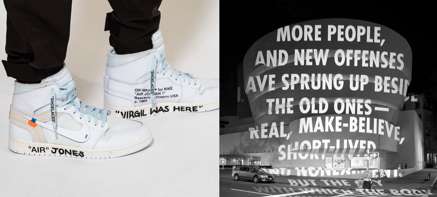
One of Abloh’s most signature design gestures is the addition of self-referential text. This text either declares the individual items onto which they are printed in quotes (such as “SHOELACES” printed on shoelaces), alludes to their cultural or physical context (such as “FOR WALKING” printed on boots Abloh designed for the Off-White Women’s Collection) or goes into more detail to impart the provenance of the entire item, including the location and date of the original design.
While self-referential text is regularly employed in the field of architecture, either as signage for navigation or as plaques that detail a building’s historical significance, several contemporary artists have also applied text to preexisting buildings to respond to their histories and contexts. American artist Jenny Holzer (with whom Abloh has collaborated), for instance, has been projecting text onto building façades and electronic signage to gain “direct access to a large public that might not give “art” any consideration, while allowing her to undermine forms of power and control that often go unnoticed.” In 2008, Holzer projected poetry onto the curved façade of the Solomon R. Guggenheim Museum that touched on site-specific issues, including the consumption of art and the use of public space.
Just as Holzer and other artists treat architecture as a site-specific canvas, so too does Abloh apply relevant text onto items of desire to transparently communicate features that might otherwise become obscured or overlooked: when he prints “SHOELACES” in quotations on a shoelace, for instance, he invites its readers to question a shoelace’s role as either functional or decorative; when he applies the shoe’s provenance onto the shoe itself, he gives design credit where credit is due.
Transparent Success
Figures of Speech, the museum catalogue of Virgil Abloh’s complete work, is a real attempt to make the designer’s success story as transparent as possible. Beyond the thoughtful use of an exposed spine, the book is divided into three sections (Museum, Index and Archives) and begins with an interview between Abloh, Rem Koolhaas and Samir Bantal of AMO on his transition from a child in Ghana to an architecture student in Chicago to a fashion icon. “[Figures of Speech],” Abloh reveals, “is the bookend to this story of me recognizing where I came from and how I got here.”
The third section of the book is an exhaustively detailed and neatly catalogued record of Abloh’s creative career and personal life, including notes from professors during his time in school, his graduate thesis, receipts, rejected proposals, documentation of meetings, text messages and a graphic layout of the contents found in the archive. There is little doubt that the thorough and candid nature of the book is inspired by S,M,L,XL, the first monograph of Rem Koolhaas’ work published by Monacelli Press in 1996. The book is described by its publisher as “a graphic overture that weaves together architectural projects, photos and sketches, diary excerpts, personal travelogues, fairy tales, and fables, as well as critical essays on contemporary architecture and society.”
Like S,M,L,XL, Figures of Speech intends to scrupulously chronicle everything from hard work to chance encounters in order to present an honest account of the designer’s career, which proves to be made up of just as many failures as successes. "It’s easier to be a critic than to produce work," Abloh once said. "So the only way to get to the end means is to start the domino effect[,] which is essentially put out bad work."
Transparency is an important concept for Abloh because, above all, he wants to communicate to his admirers that success did not come easily to him, nor did it come without help from his peers and predecessors. As a Black man who has made a name for himself in predominantly white industries, Abloh hopes to inspire others who are systematically marginalized. “If Abloh’s driving impulse as a young man was to consume and to participate,” Taiye Selasi writes in her essay for Figures of Speech, “then his driving impulse as a creator has been to redefine what Black men can consume and how black men can participate.”
The desire to become didactic in his position is apparent not only in his lectures, conversations and documentation of his work, but it is also apparently manifested as ‘transparency,’ in one way or another, throughout all of his design work.


